The Average Number of Starters Based on Lead
- 0 Comments
Now that I’ve looked at how the average number of starters changes based on time, I want to take a look at how this statistic changes based on a team’s lead (or deficit).
The ultimate goal from all of this is to model realistic substitution patterns over the course of a game, as this is important for a realistic simulation. Therefore, I am hoping that this problem will be easier to tackle after looking at these general models of how the average number of starters changes based on game situation.
The Data
To create this basic model, I went through the 2007-2008 regular season play-by-play data and kept track of two things: the home team’s lead (or deficit) and the number of starters in the game for each team. These data points were taken at one minute intervals from the start of the game (0 minutes elapsed) to one minute remaining (47 minutes elapsed). Also, I stripped out anything less than -25 and greater than 25 due to the unrealistic shapes they were forcing into the splines.
My next post will make an attempt at modeling the average number of starters based on elapsed time and lead, so I selected this data collection method so that this joint distribution of elapsed time and lead can be related back to this post and the previous post.
The Model
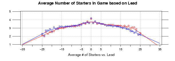
The graph below illustrates the data:
Click Image for Full Size
In the graph above, the y-axis, from 5 to 1, is the average number of starters in the game based on the team’s lead (or deficit). The x-axis, from -35 to 35, represents the lead (negative numbers represent a deficit). The blue dots and lines represent the home team, and the red dots and lines represent the away team. The lines are drawn from smoothing splines that I fit with R for each team.
So for any given time in the game, the average number of starters decreases based on the number of points a team is leading (or trailing) by. Thus you’re going to, on average, see more starters in the game when the game is close. This shouldn’t be ground breaking news to anyone, but this should give a good visual representation of how the average number of starters varies based on a team’s lead.
One thing I find interesting is that teams still average roughly 2 starters when the game is a blowout. I suspect this result has something to do with when this high margin is taking place early in the game (say before the 4th quarter), so I’m interested in seeing how the average changes when taking into account the elapsed time and the lead.
Reproduce These Results
In this archive you will find the data and R code I used to create the graph above and the smoothing splines fit to the data.
To run the code: extract the archive, open R, and run: source(”starters.R”)
The Next Step
In my last diversion (for now) into how the average number of starters changes in an NBA game, I will make a basic model that takes into account both elapsed time and lead. This should prove useful when trying to understand exact substitution patterns, but it should also prove useful when looking at how other statistics change based on elapsed time and lead.
